Code
## SET UP ######################################################################
# Load packages
library(EVR628tools)
library(tidyverse)
library(cowplot)
# Load data
data("data_geartypes") # In your case you will load them from your data/processed folder
## PROCESSING ##################################################################
# My data are already clean, but I need to make some final touches for visualization
data_vis <- data_geartypes |>
mutate(
geartype = str_replace_all(geartype, "_", " "), # swap the underscores for spaces
geartype = str_to_sentence(geartype), # Make them into sentence case
geartype = fct_lump_n(geartype, 5), # Lump them (5 categories + others)
geartype = fct_reorder(geartype, effort_hours, .fun = mean)) # Order them based on mean effort
## VISUALIZE ###################################################################
# Build a figure
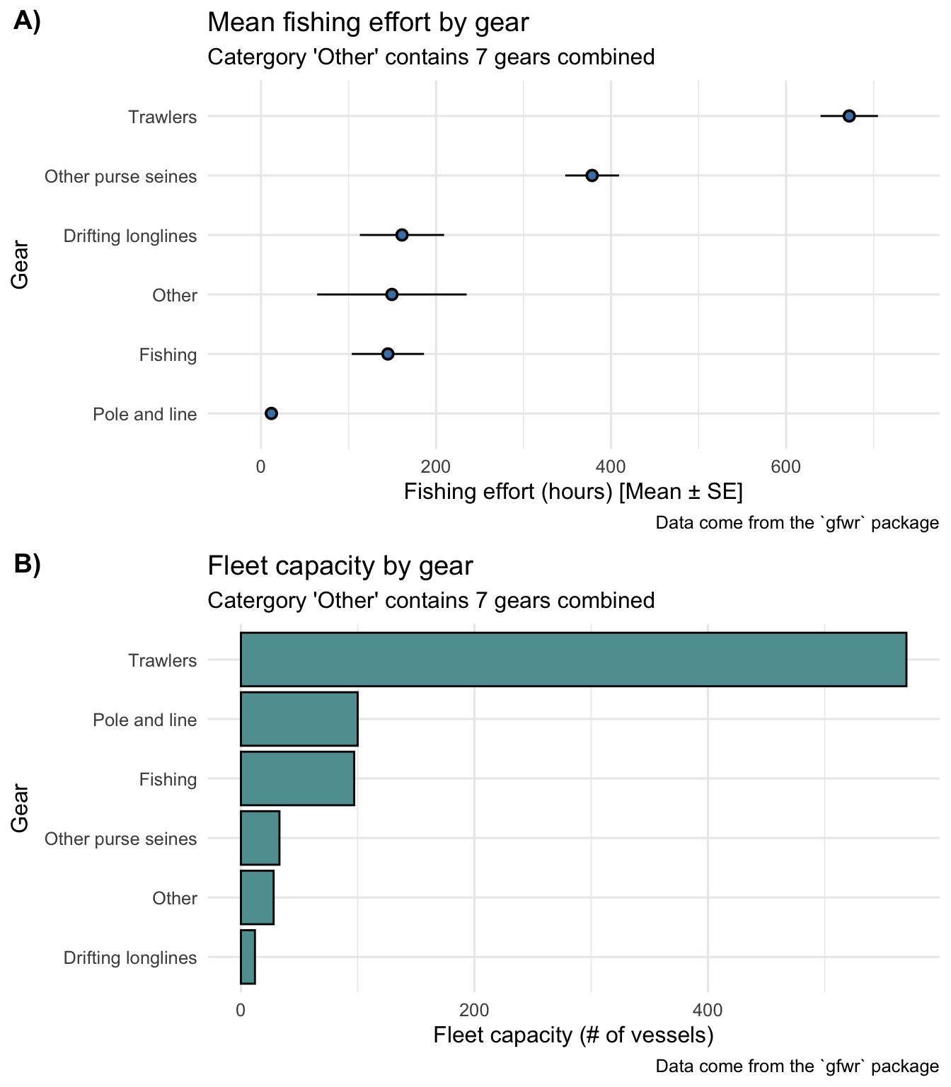
p1 <- ggplot(data = data_vis,
mapping = aes(x = effort_hours, y = geartype)) +
stat_summary(geom = "pointrange",
fun.data = mean_se,
pch = 21,
color = "black",
fill = "steelblue") +
labs(title = "Mean fishing effort by gear",
subtitle = "Catergory 'Other' contains 7 gears combined",
x = "Fishing effort (hours) [Mean ± SE]",
y = "Gear",
caption = "Data come from the `gfwr` package") +
theme_minimal(base_size = 12) +
scale_x_continuous(expand = c(0.1, 1))
# Build my second figure
p2 <- data_vis |>
group_by(geartype) |>
summarize(n_vessels = n_distinct(vessel_id)) |>
ggplot(mapping = aes(x = n_vessels, y = fct_reorder(geartype, n_vessels))) +
geom_col(fill = "cadetblue", color = "black") +
labs(title = "Fleet capacity by gear",
subtitle = "Catergory 'Other' contains 7 gears combined",
x = "Fleet capacity (# of vessels)",
y = "Gear",
caption = "Data come from the `gfwr` package") +
theme_minimal(base_size = 12)
my_plot <- plot_grid(p1, p2,
ncol = 1,
labels = c("A)", "B)"))
## EXPORT ######################################################################
ggsave(plot = my_plot,
filename = "results/img/effort_and_capacity.png", # Export my file as png
width = 8,
height = 8)