| id | total_length_mm |
|---|---|
| 001-Po-16/05/10 | 213 |
| 002-Po-29/05/10 | 124 |
| 003-Pd-29/05/10 | 166 |
Week 2: Data visualization
EVR 628- Intro to Environmental Data Science
Example: Lionfish Biometry
data_lionfish, from theEVR628toolspackage- Contains biometric measurements for 109 lionfish (Pterois volitans) captured off Puerto Aventuras (Mexico)
Tip
Use ?data_lionfish to look at the documentation.
Visualizing for Yourself
Examples
Code
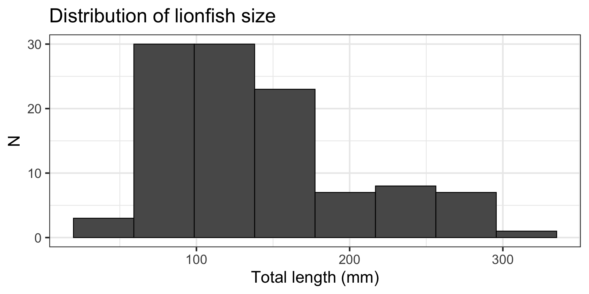
Message: “Most lionfish are around 100 mm in length”
Histogram:
- Shows two numeric variables
- Binned continuous
- Counts within each bin
- Shows the distribution of the data
- Built with
ggplot2::geom_histogram()
Examples
Code
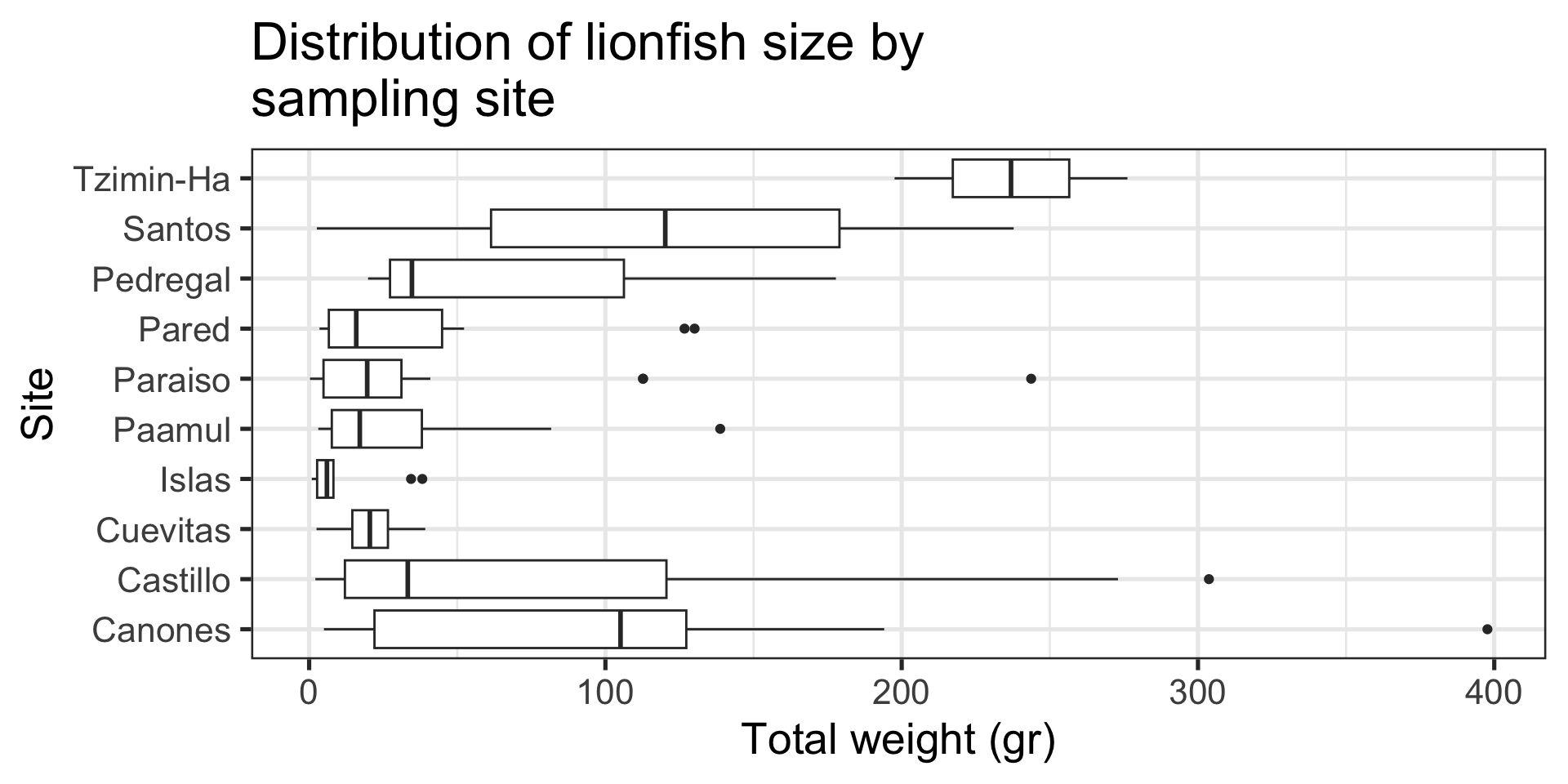
Message: “Tzimin-Ha has the heaviest fish”
Boxplot:
- Distribution of a continuous variable by groups
- Line inside box shows median
- Outlines of box show 25th and 75th percentiles
- Whiskers extend from hinge to the largest value within \(1.5 \times IQR\) from the hinge
- Points are “outlying” observations
Tip
Use this one with care. It packs a lot of information and not everyone knows (remembers) how to read it.
Examples
Code
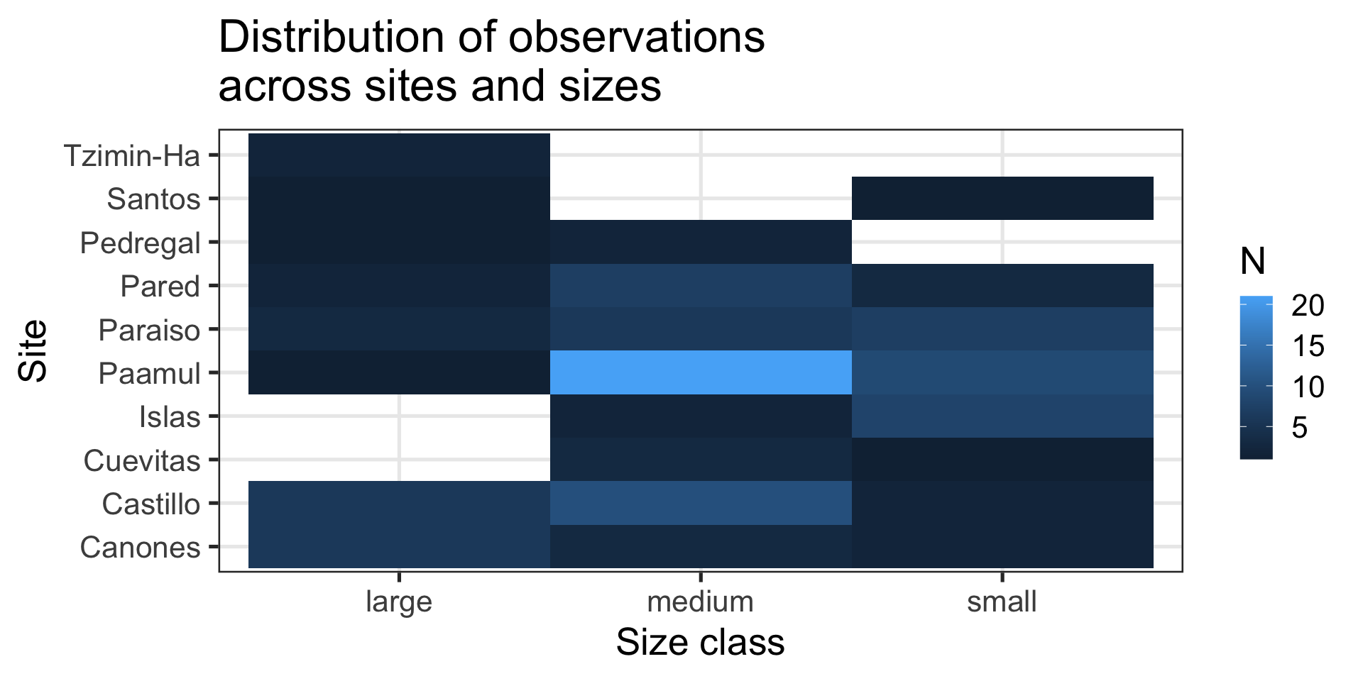
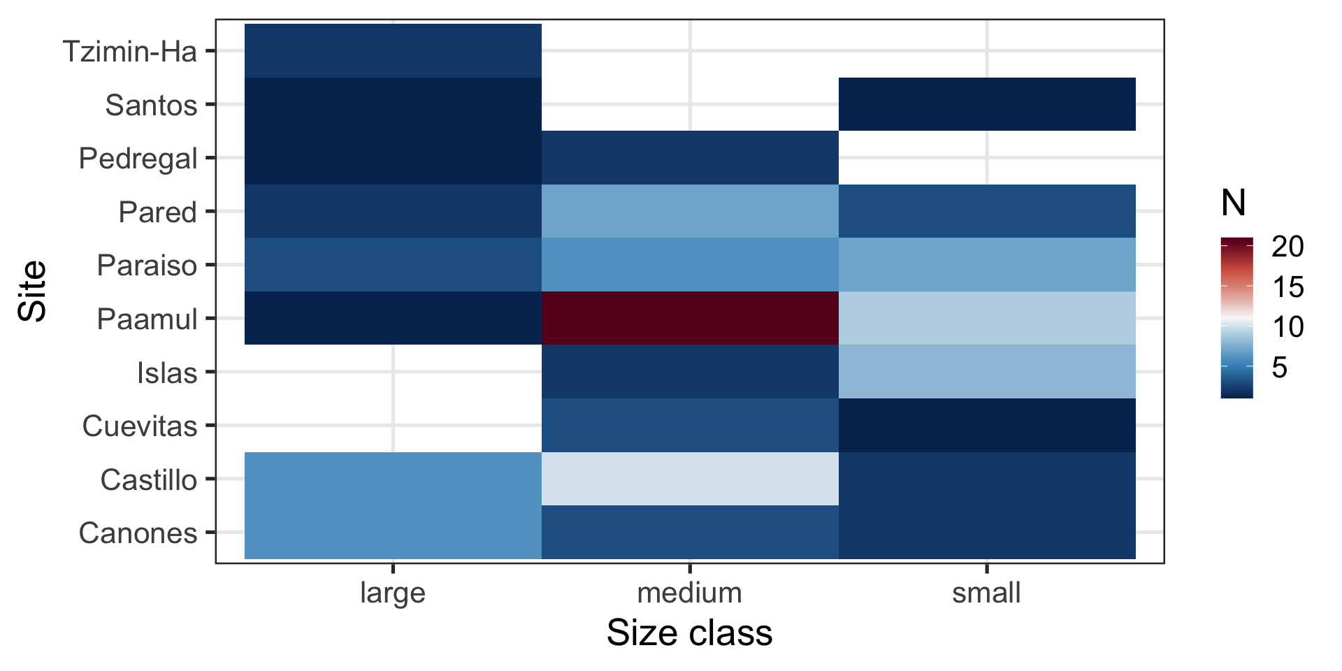
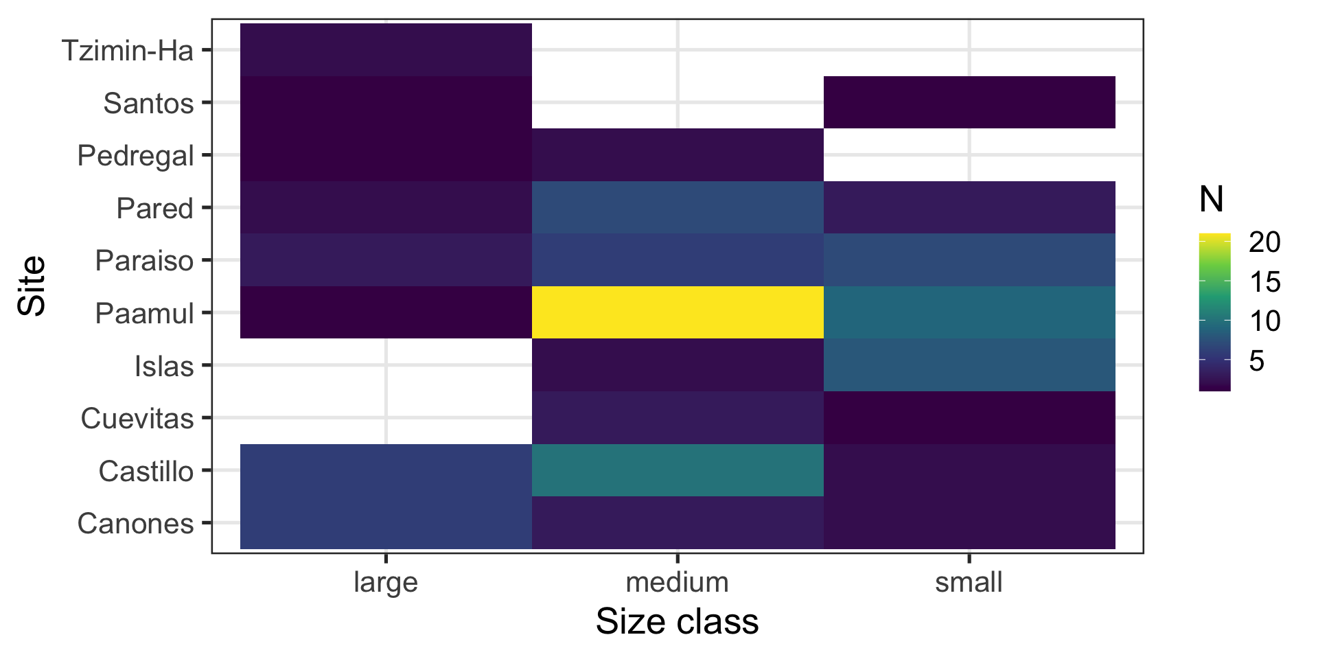
Message: “Most fish are medium sized and come from Paamul”
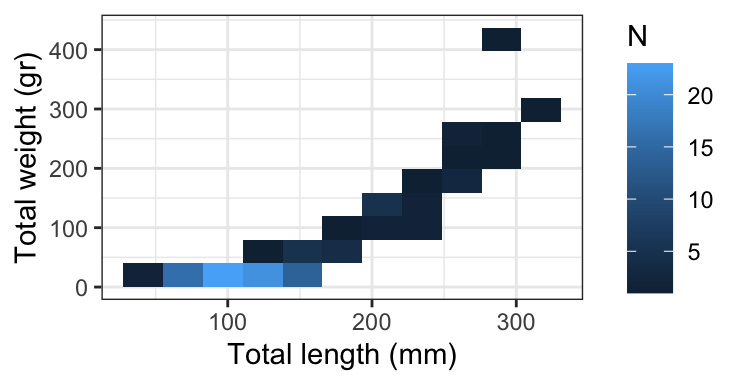
Heatmap:
- Shows counts across two variables at the same time
- Uses
ggplot2::geom_bin_2d()
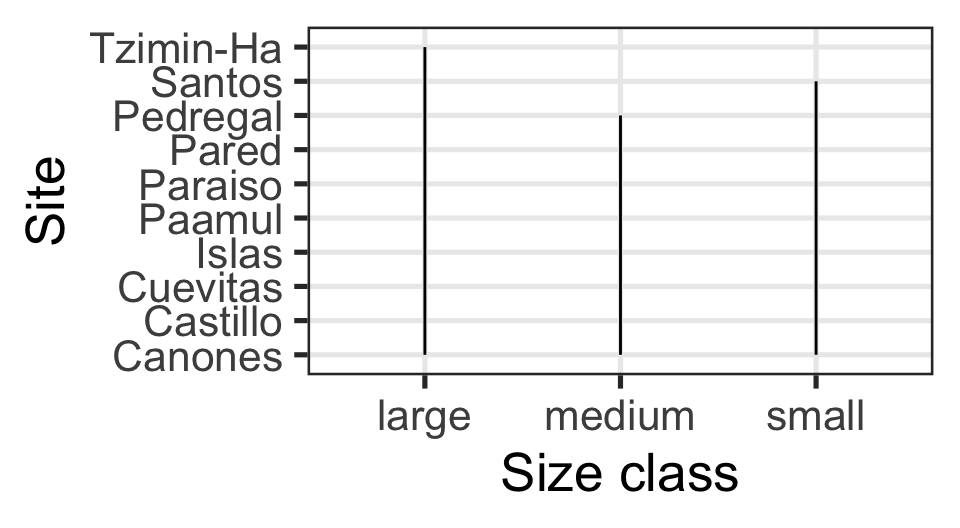
Is my x-axis bothering you?
R does not know that there is a logical order (small -> medium -> large).
Examples
Code
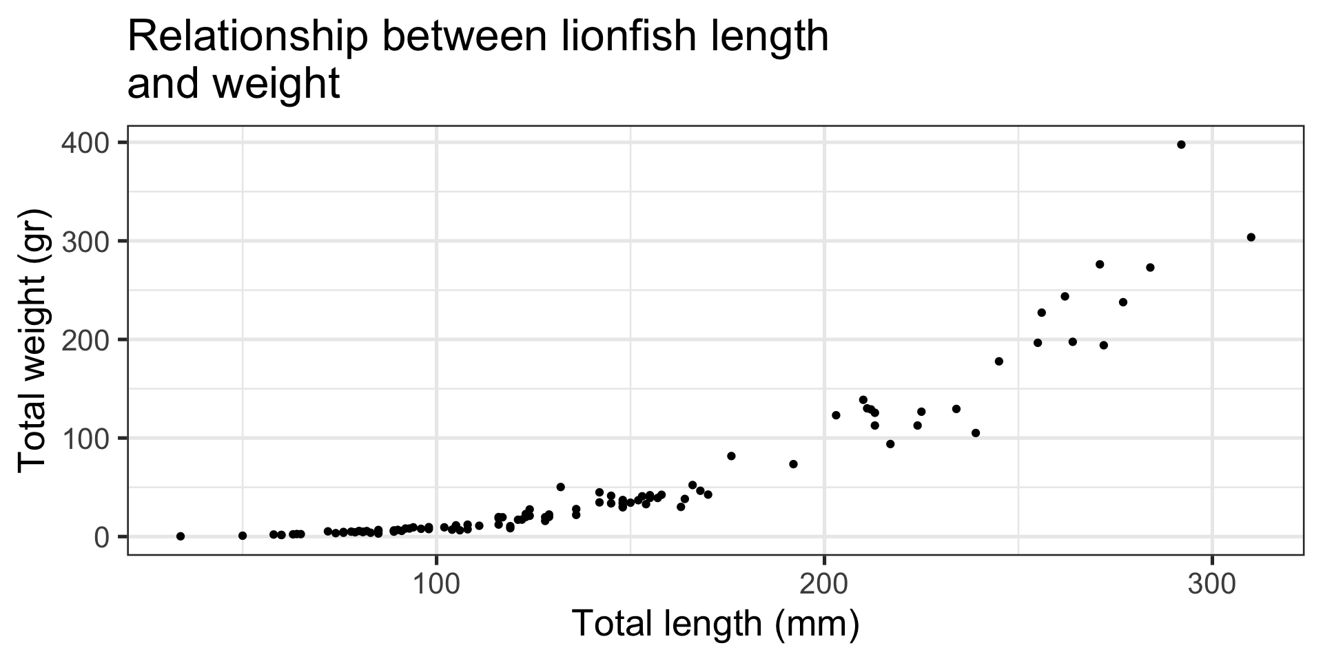
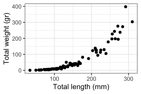
Message: “Look, slightly larger fish are waaaay heavier!”
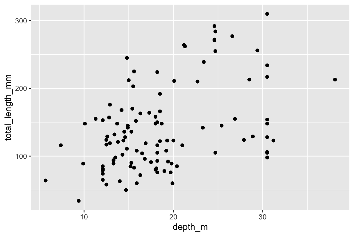
Scatterplot:
- Relationship between two continuous numeric variables
- Represented with points
- Uses
ggplot2::geom_point()
Examples
Code
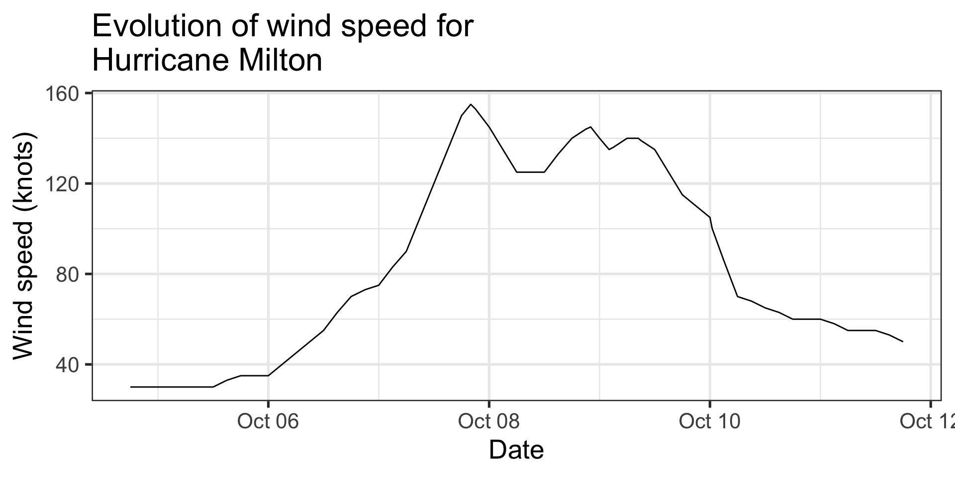
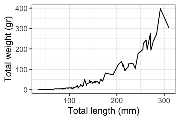
Message: “The wind speed of a hurricane was highest the night of Oct 7th”
Line chart:
- Evolution of one variable along another
- Conveys a sense of continuity even if our observations are not
- Uses
ggplot::geom_line()
Examples
Code
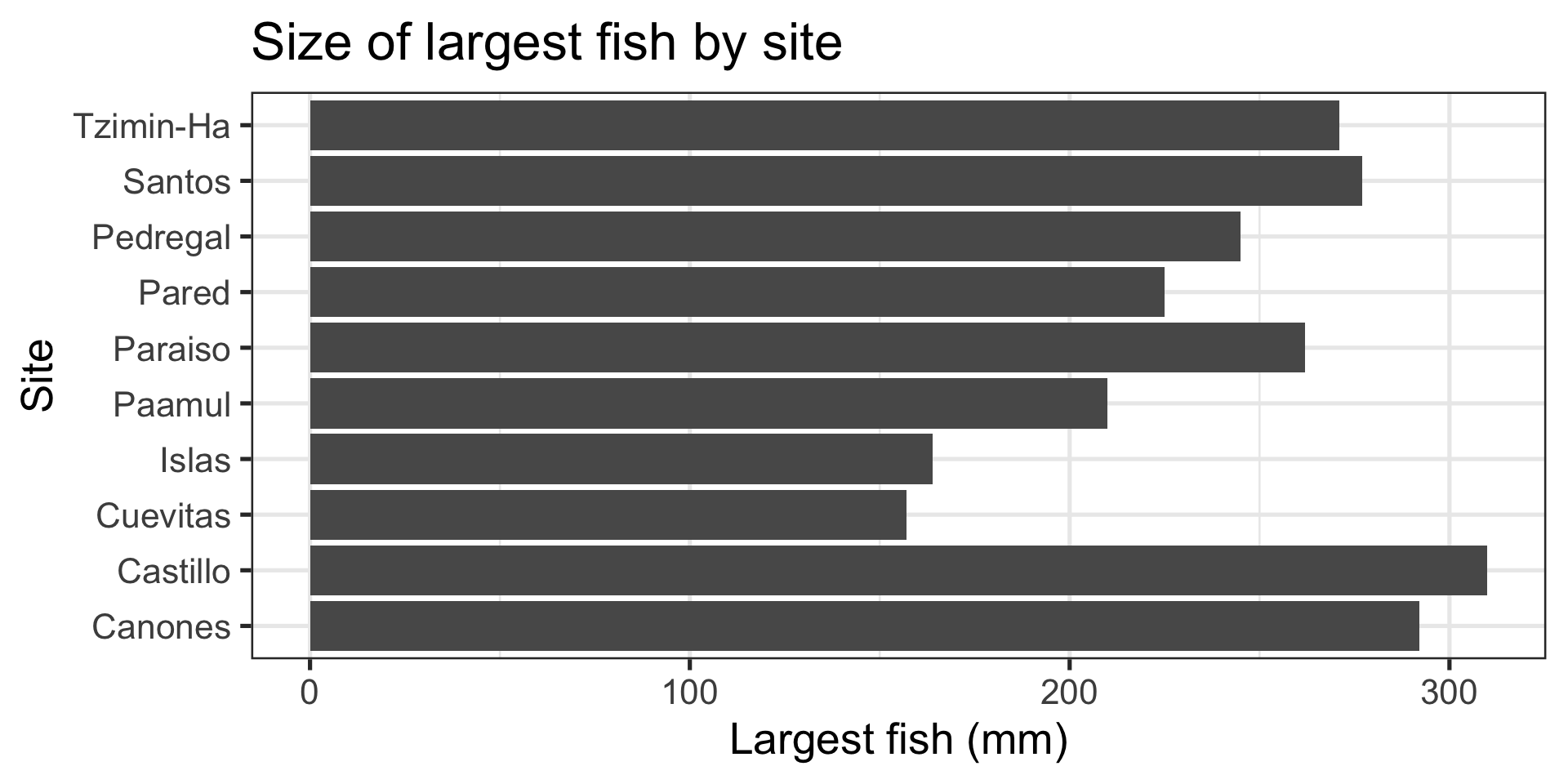
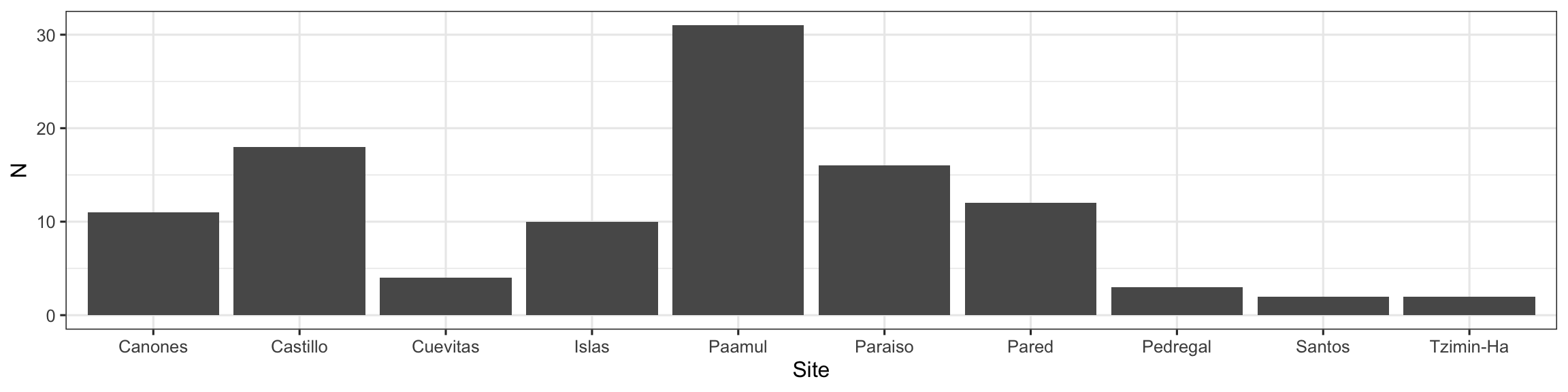
Message: “Largest fish comes from Castillo”
Column:
- Relationship between categorical and numeric variable
- Represented with “columns” or “bars”
- This case uses
ggplot2::geom_col(), but there is alsoggplot2::geom_bar()
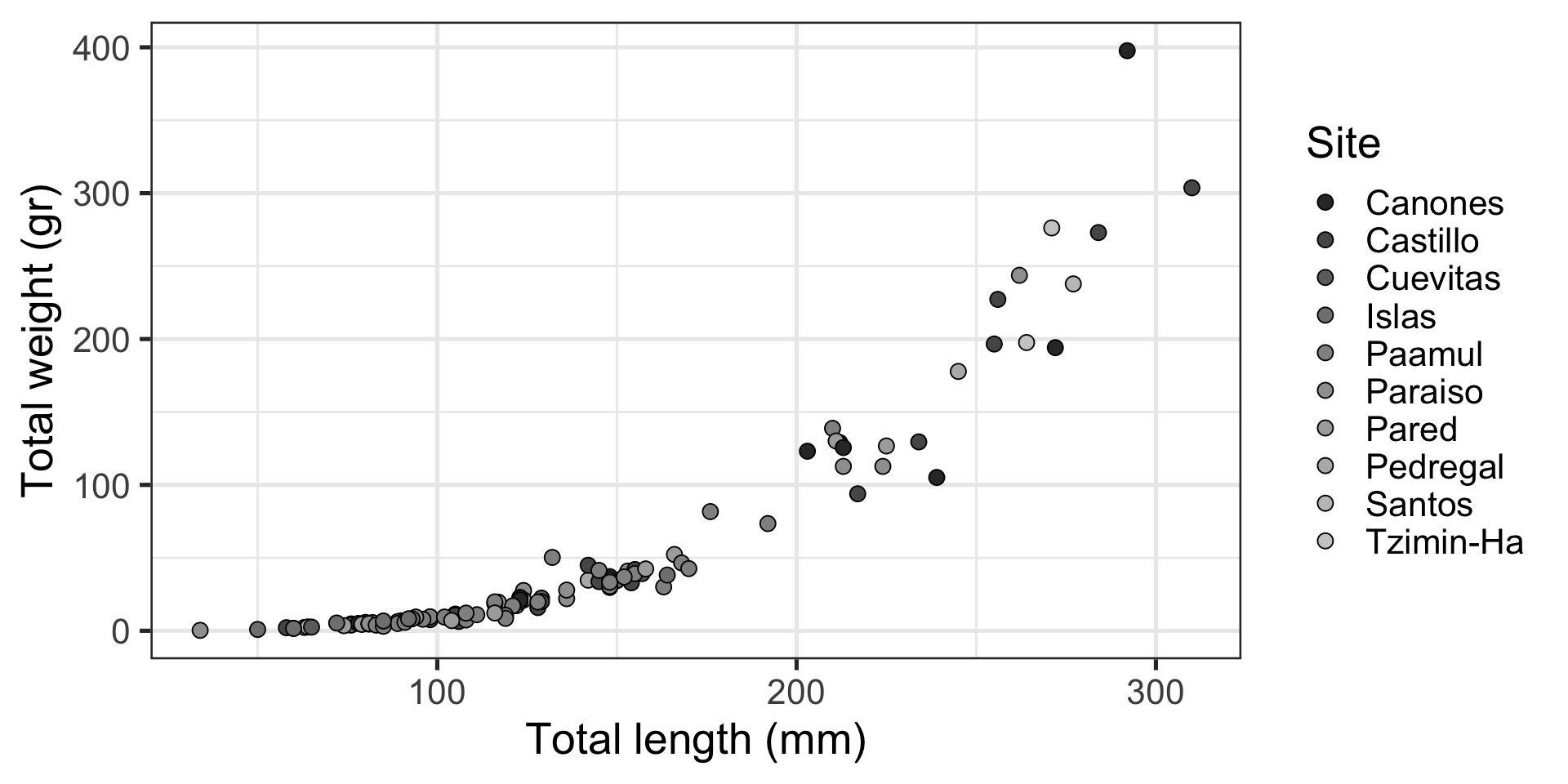
Same Data, Multiple Plots
Which is best at showing the relationship between size and weight?
Which is best at showing the size and weight of most fish?
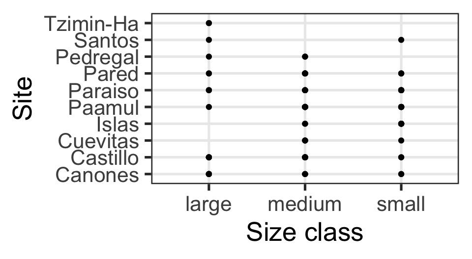
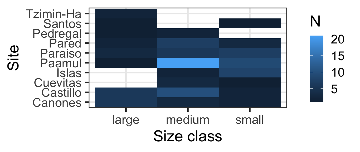
Same Data, Multiple Plots
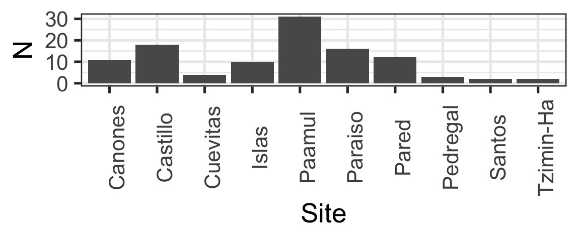
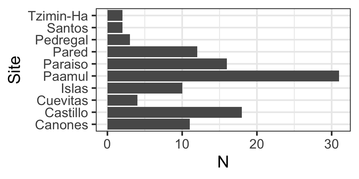
Which is best at showing me the number of samples by site and size?
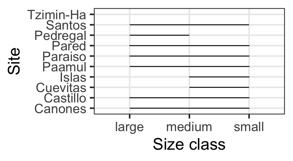
Simplify
Which one is better? Why?
Code
p <- ggplot(data = data_lionfish,
       mapping = aes(x = total_length_mm,
                     y = total_weight_gr)) +
  geom_point()

p +
  theme_gray() +
  scale_x_continuous(breaks = seq(0, 350, by = 15),
                     limits = c(0, 350)) +
  scale_y_continuous(breaks = seq(0, 400, by = 20),
                     limits = c(0, 400)) +
  theme(axis.line = element_line(color = "black"),
        panel.grid = element_line(color = "black")) +
  labs(title = "Total length (mm) vs total weight (gr) for 109 lionfish sampled from Mexico",
       subtitle = "Note that the largest fish is not the heaviest fish")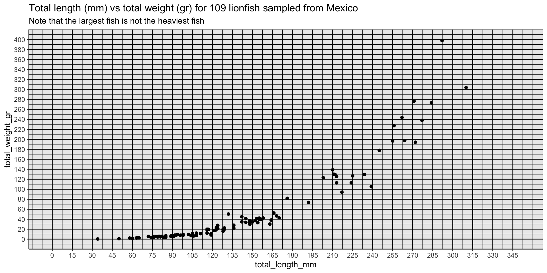
Code
longest <- data_lionfish |> slice_max(total_length_mm)
heaviest <- data_lionfish |> slice_max(total_weight_gr)

p +
  geom_text_repel(data = longest,
                  label = "Longest",
                  nudge_x = -5,
                  nudge_y = -150,
                  size = 5) +
  geom_text_repel(data = heaviest,
                  label = "Heaviest",
                  nudge_x = -50,
                  nudge_y = -10,
                  size = 5) +
  theme_minimal(base_size = 14) +
  theme(axis.text = element_text(color = "black", size = 10),
        axis.title = element_text(color = "black", size = 12)) +
  labs(x = "Total length (mm)",
       y = "Total weight (gr)") +
  labs(title = "There's always a bigger fish",
       subtitle = "The largest fish is not the heaviest fish")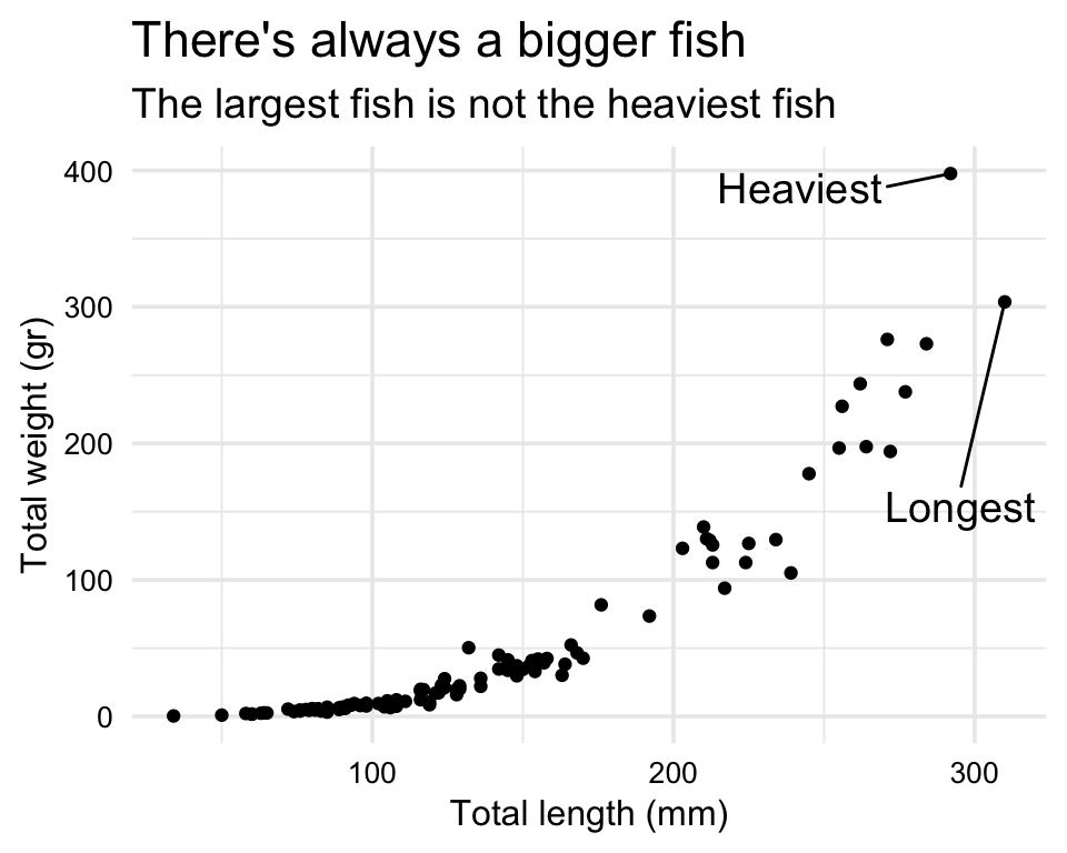
Text
Color Scheme
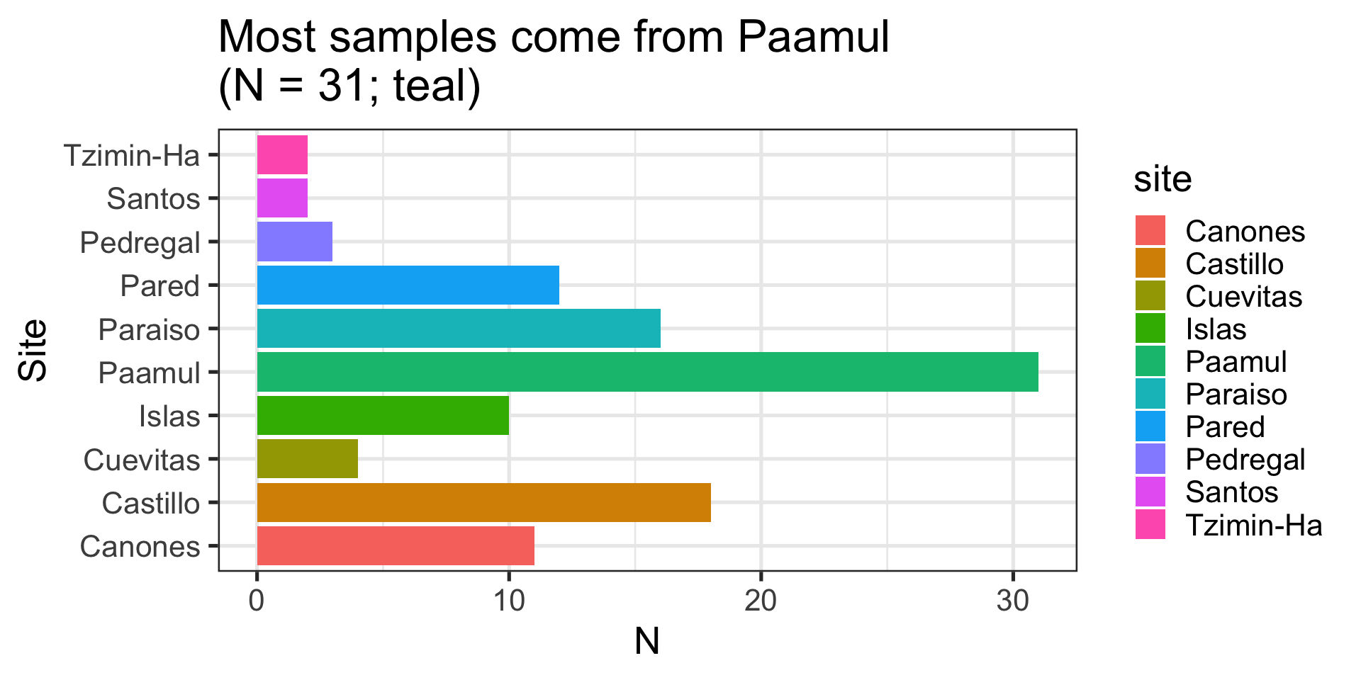
Code
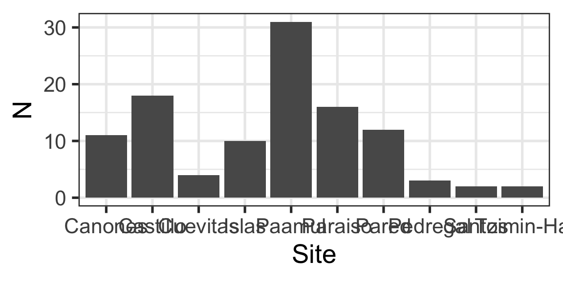
ggplot(data = data_lionfish,
       mapping = aes(x = site, fill = site == "Paamul")) +
  geom_bar() +
  scale_fill_manual(values = c("FALSE" = "gray",
                               "TRUE" = "darkred")) +
  coord_flip() +
  labs(x = "Site", y = "N",
       title = "N = 31 come from <span style='color:darkred;'>Paamul</span>") +
  theme(plot.title = element_markdown(),
        axis.title.y = element_markdown(),
        legend.position = "None") +
  scale_y_continuous(expand = c(0, 0),
                     limits = c(0, 32))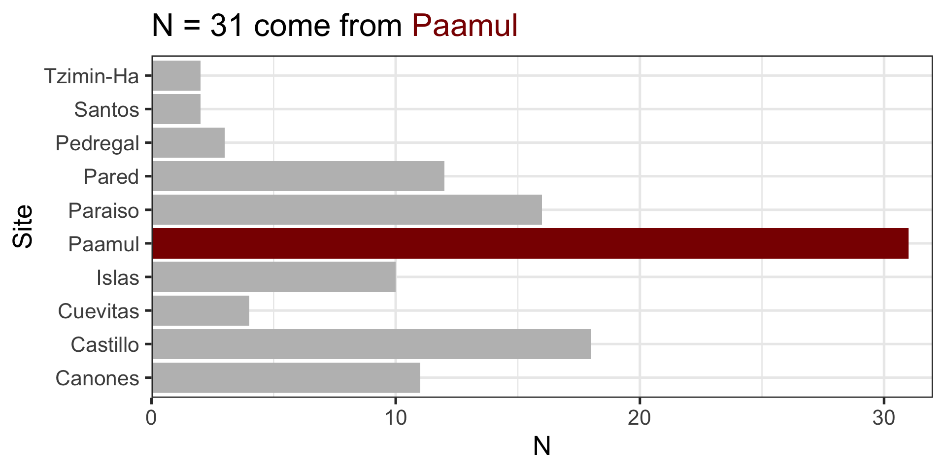
Do you really need to use color?
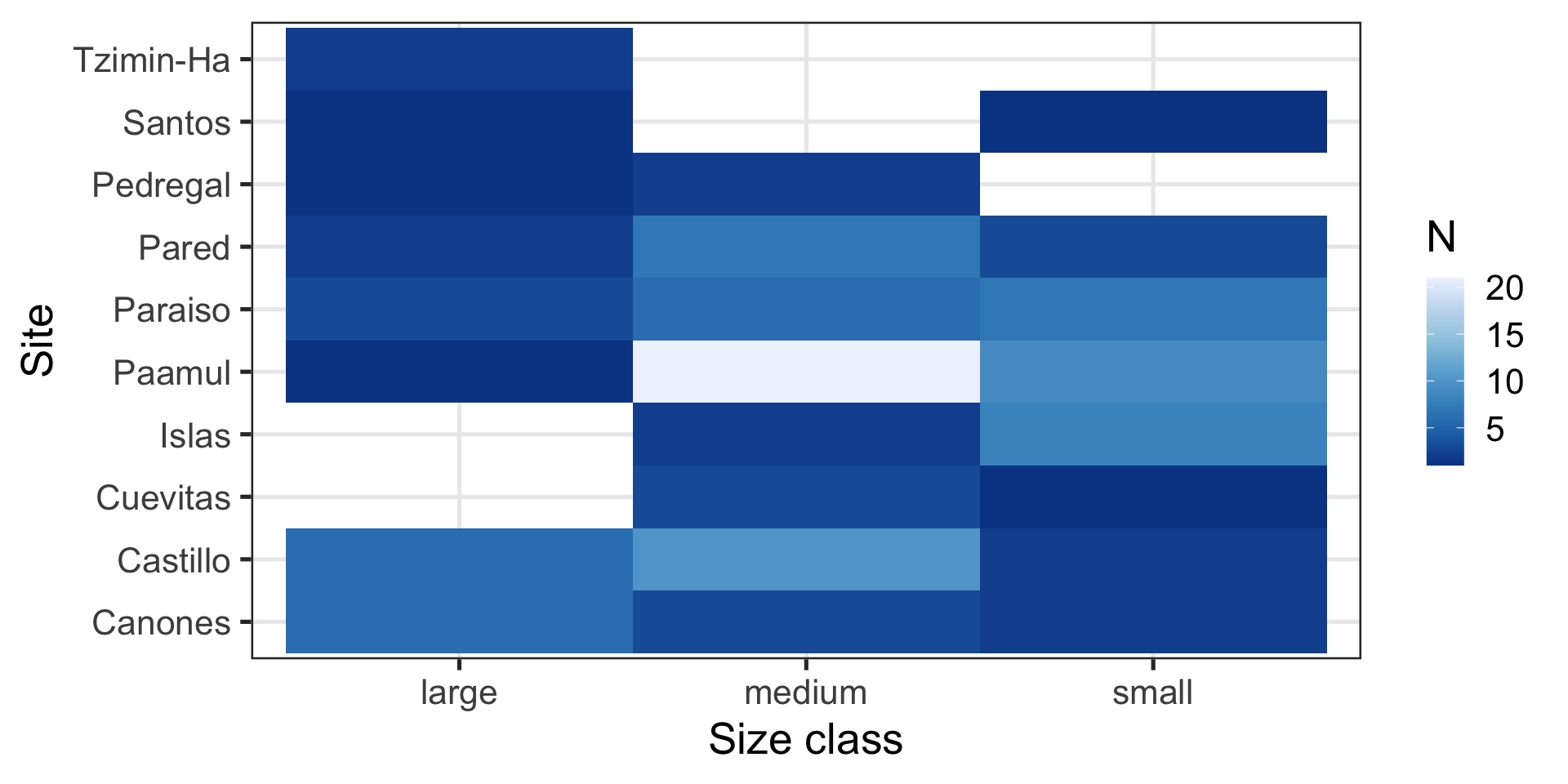
Use better colors
Avoid redundant use of your limited aesthetics (x, y, size, color, shape)
Categorical data
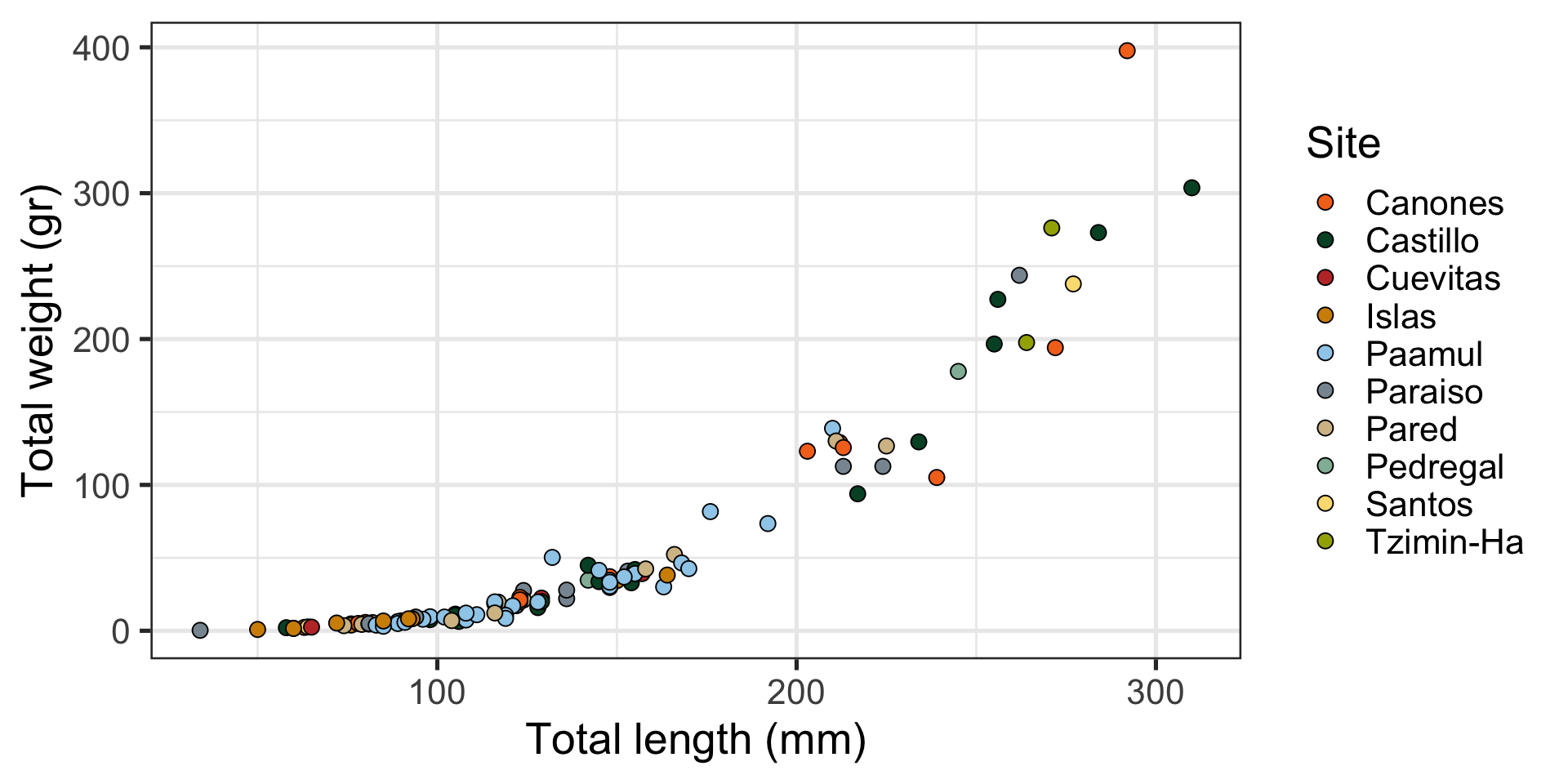
Use a discrete color palette for categorical data
It is difficult to track more than (6) 10 colors
These colors come from EVR628tools::palette_UM(), using UM’s visual style guide
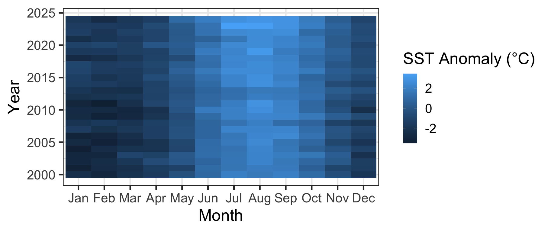
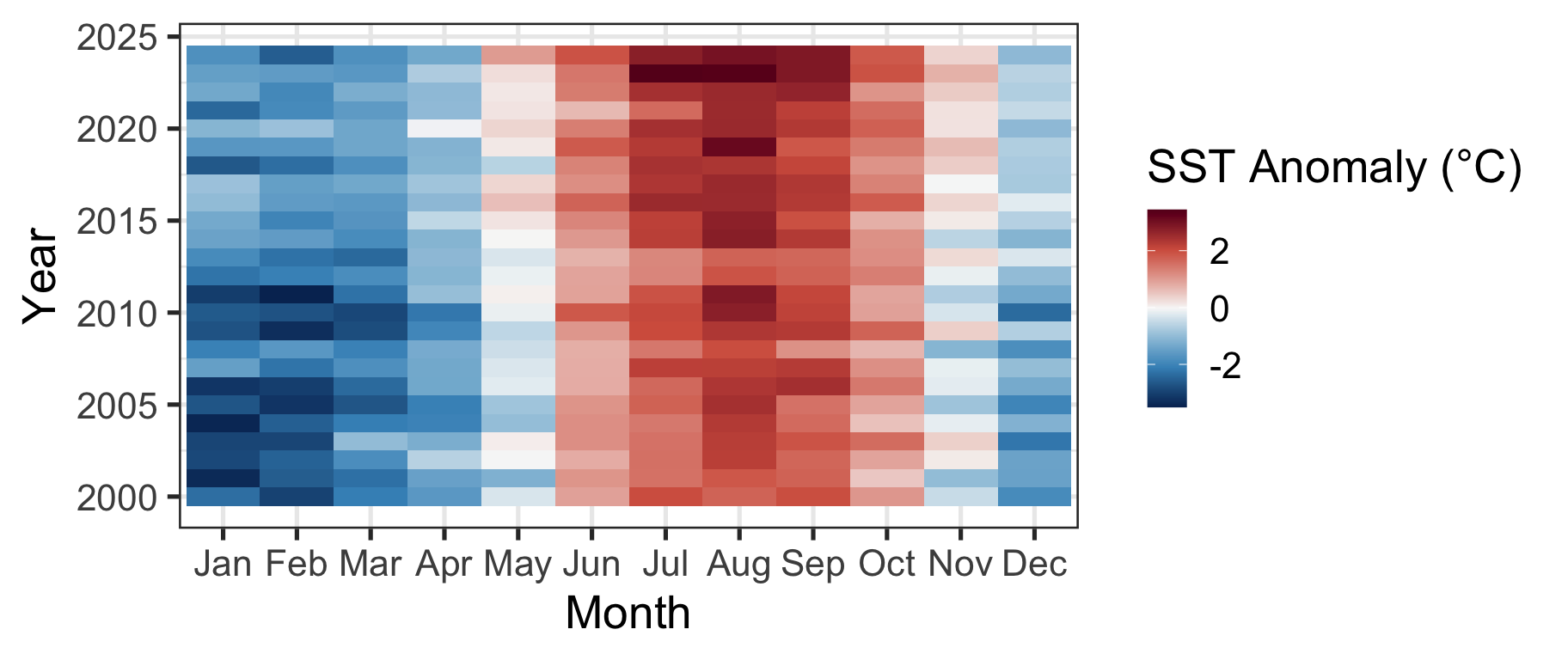
Ordinal or numeric
Diverging
When was it warmer / colder / average?
Single hue palette
Other Ways of Representing Information
- We’ve tried position (horizontal and vertical) and color
- There is also:
- size
- shape
- aspect (line width, line type)
- Our brains struggle to compare sizes
- We can only track ~6 shapes at a time
- Avoid using these for your most important message
Code
ggplot(data = data_lionfish,
       mapping = aes(x = total_length_mm, y = total_weight_gr, color = depth_m, size = fct_relevel(size_class, c("small", "medium", "large")), shape = site)) +
  geom_point() +
  labs(x = "Total length (mm)",
       y = "Total weight (gr)",
       color = "Site",
       shape = "Site",
       size = "Size class") +
  scale_shape_manual(values = c(1:10))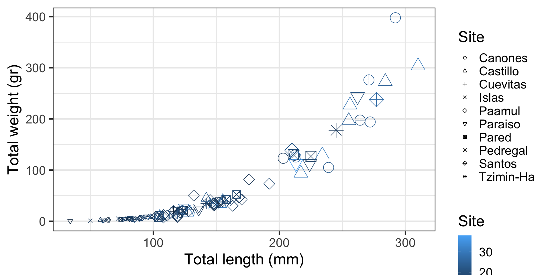
Goal
1. Specify the Data

2. Specify the aesthetics
2. Specify the aesthetics
3. Specify the geometric Representation
4. Modify Geoms as Needed

5. Modify Labels as Needed
5. Modify Labels as Needed
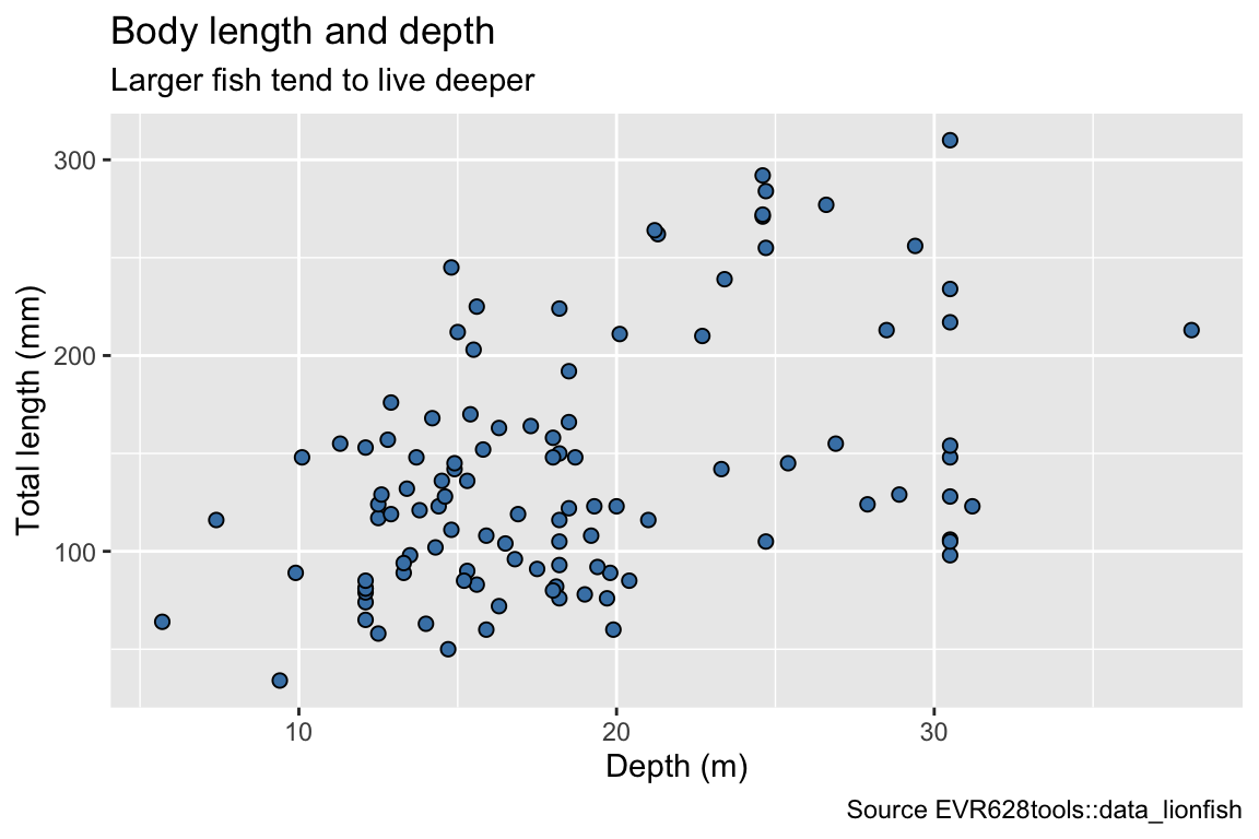
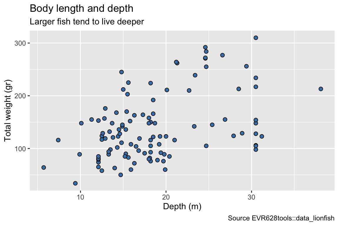
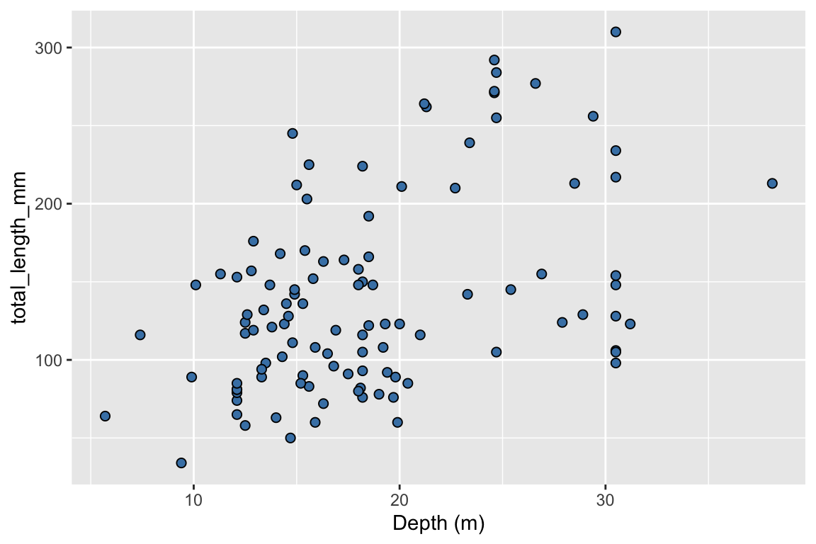
ggplot(data = data_lionfish,
mapping = aes(x = depth_m, y = total_length_mm)) +
geom_point(shape = 21, fill = "steelblue", size = 2) +
labs(x = "Depth (m)",
y = "Total length (mm)",
title = "Body length and depth",
subtitle = "Larger fish tend to live deeper",
caption = "Source EVR628tools::data_lionfish")