Scaling up your data visualizations (Part 1)
EVR 628- Intro to Environmental Data Science
2. Specify the aesthetics
3. Specify the geometric Representation
4-5. Modify geoms and labels
geoms on top of geoms 1
Code
ggplot(data = data_lionfish,
       mapping = aes(x = total_length_mm, y = total_weight_gr)) +
  geom_smooth(color = "black", linetype = "dashed") +
  geom_vline(xintercept = c(100, 200), linetype = "dashed") +
  geom_point(aes(color = size_class), size = 2) +
  scale_color_manual(values = palette_UM(3)) +
  labs(x = "Total length (mm)",
       y = "Total weight (gr)",
       color = "Size class") +
  theme(legend.position = "inside",
        legend.justification = c(0, 1),
        legend.position.inside = c(0, 1),
        legend.background = element_blank())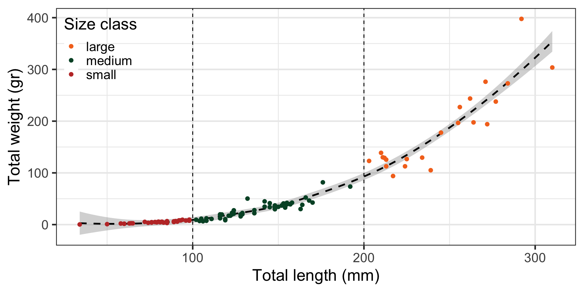
geoms on top of geoms 2
geoms on top of geoms 2
geoms on top of geoms 2
geoms on top of geoms 3
Code
data(data_mhw_events)

ggplot(data = data_mhw_events,
       mapping = aes(x = date_peak, y = intensity_max,
                     color = intensity_max)) +
  geom_linerange(mapping = aes(ymin = 0,
                               ymax = intensity_max),
                 linewidth = 1) +
  geom_point(size = 2) +
  scale_color_gradient(low = "gray90", high = "red") +
  labs(x = "Date peak",
       y = "MHW Intensity (°C)",
       color = "MHW Intensity (°C days)") +
  theme(legend.position = "bottom",
        legend.title.position = "top",
        legend.key.width = unit(1, "cm"))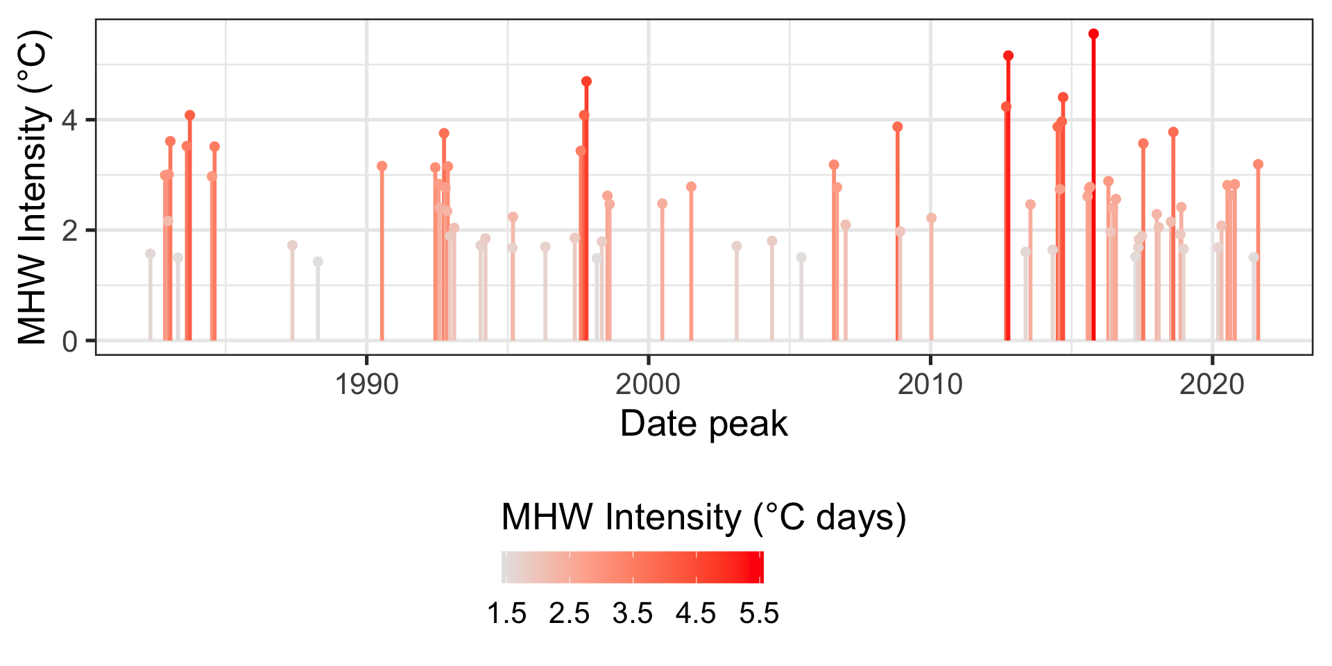
Facetting with wrap
When specifying groups and colors is not enough
Facetting with grid
Code
tidy_kelp <- data_kelp |>
  filter(genus_species %in% c("Embiotoca jacksoni",
                              "Embiotoca lateralis"),
         location %in% c("ASA", "ERE", "ERO")) |>
  pivot_longer(cols = starts_with("TL_"),
               names_to = "total_length",
               values_to = "N",
               values_drop_na = T) |>
  group_by(location, site, transect, genus_species) |>
  summarize(total_N = sum(N)) |>
  group_by(location, site, genus_species) |>
  summarize(mean_N = mean(total_N))

ggplot(data = tidy_kelp,
       mapping = aes(x = site, y = mean_N)) +
  geom_col() +
  facet_grid(location ~ genus_species) +
  labs(x = "Site", y = "Mean (org / tranect)")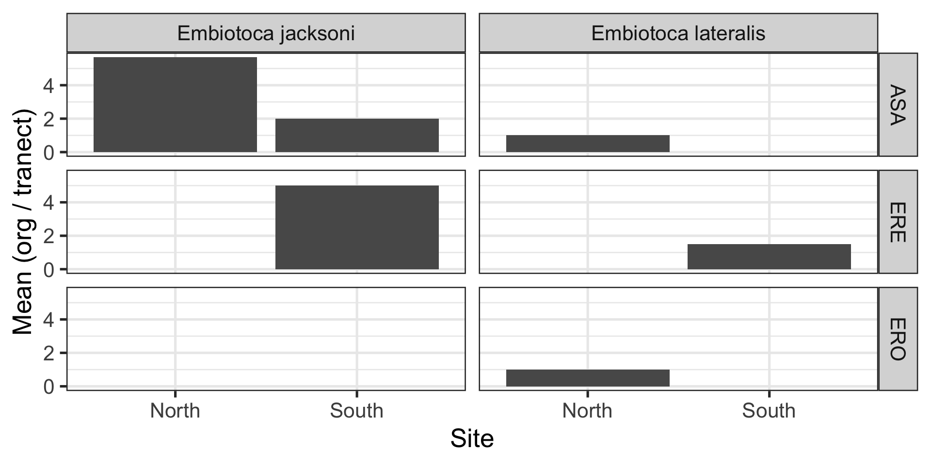
ggplot extension 1: cowplot
Code
library(cowplot)
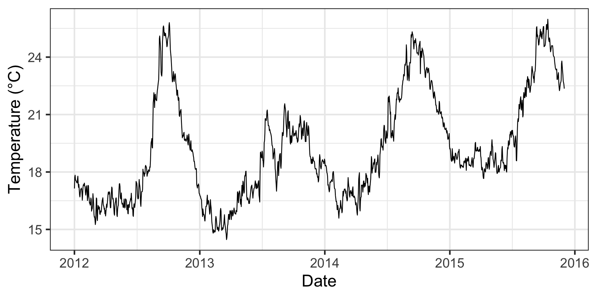
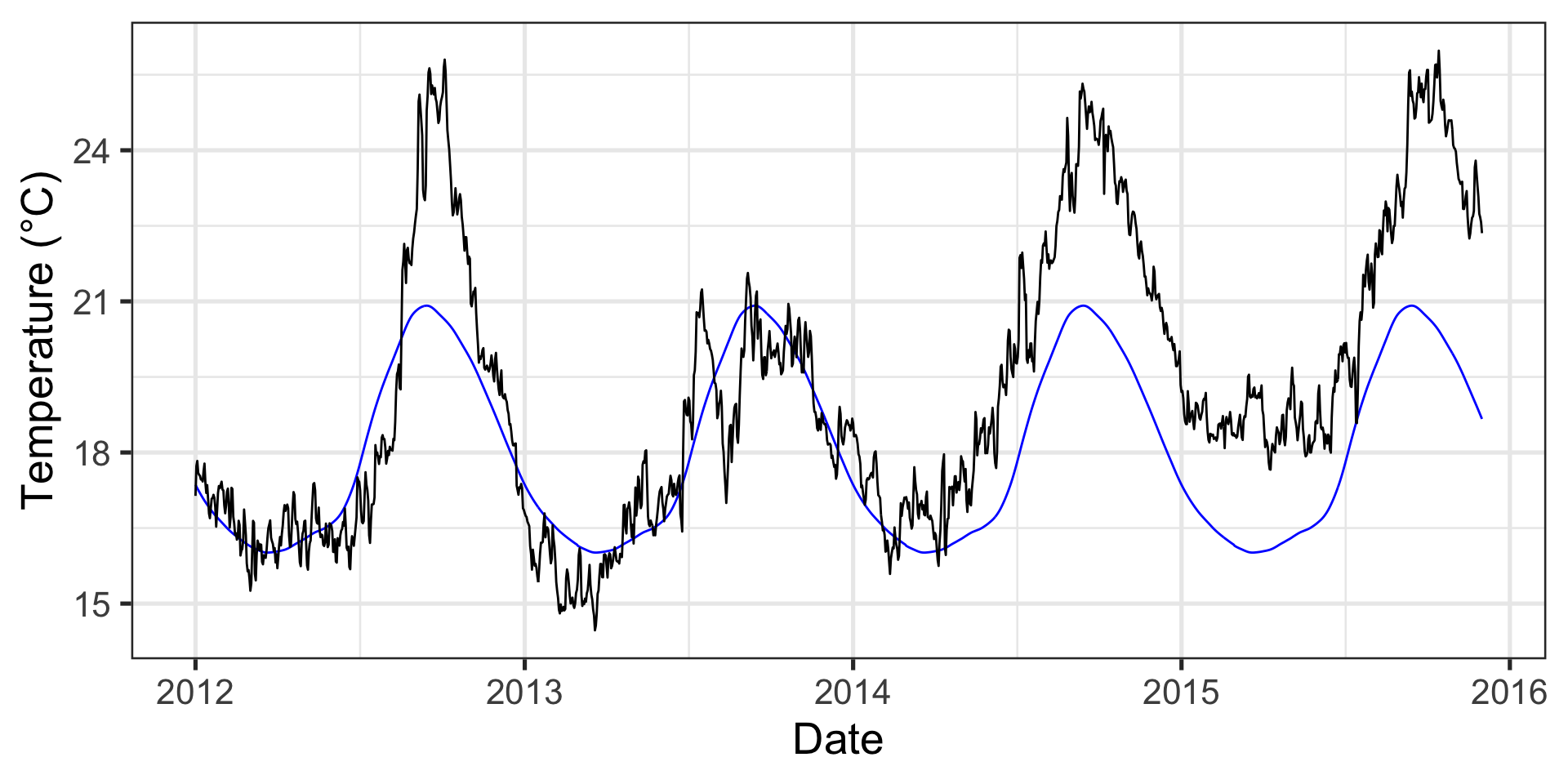
p1 <- ggplot(data = data_mhw_ts, aes(x = date, y = temp)) +
geom_line() +
geom_line(aes(y = seas), color = "blue") +
geom_line(aes(y = thresh), color = "red") +
labs(x = "Date", y = "Temperature (°C)")
p2 <- ggplot(data = data_mhw_events,
mapping = aes(x = date_peak, y = intensity_max,
color = intensity_max)) +
geom_linerange(mapping = aes(ymin = 0,
ymax = intensity_max),
linewidth = 1) +
geom_point(size = 2) +
scale_color_gradient(low = "gray90", high = "red") +
labs(x = "Date peak",
y = "MHW Intensity (°C)",
color = "MHW Intensity (°C days)") +
theme(legend.position = "bottom",
legend.title.position = "top",
legend.key.width = unit(1, "cm"))
plot_grid(p1, p2, ncol = 1, rel_heights = c(0.5, 1))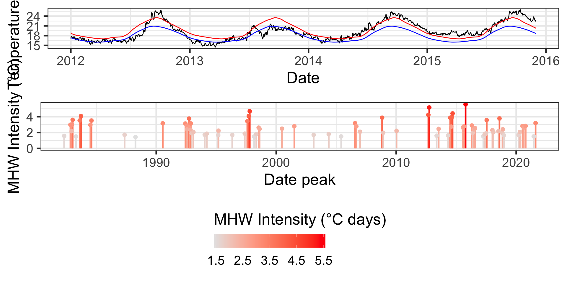
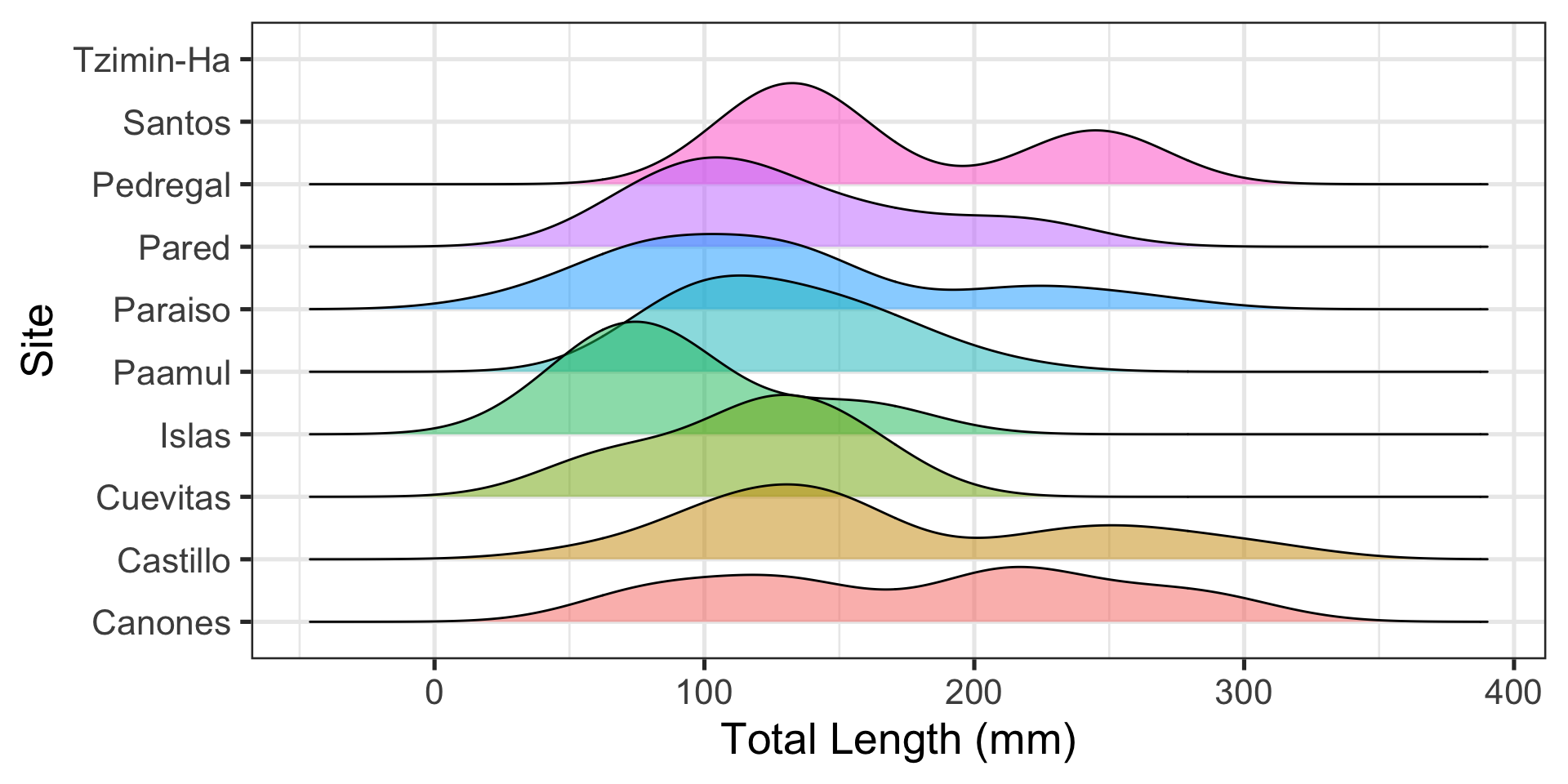
ggplot extension 2: ggridges
Visualizing distributions across groups is difficult
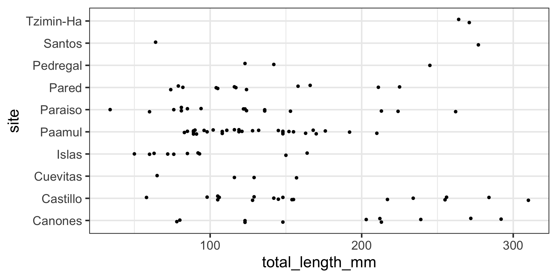
Position adjustments with points
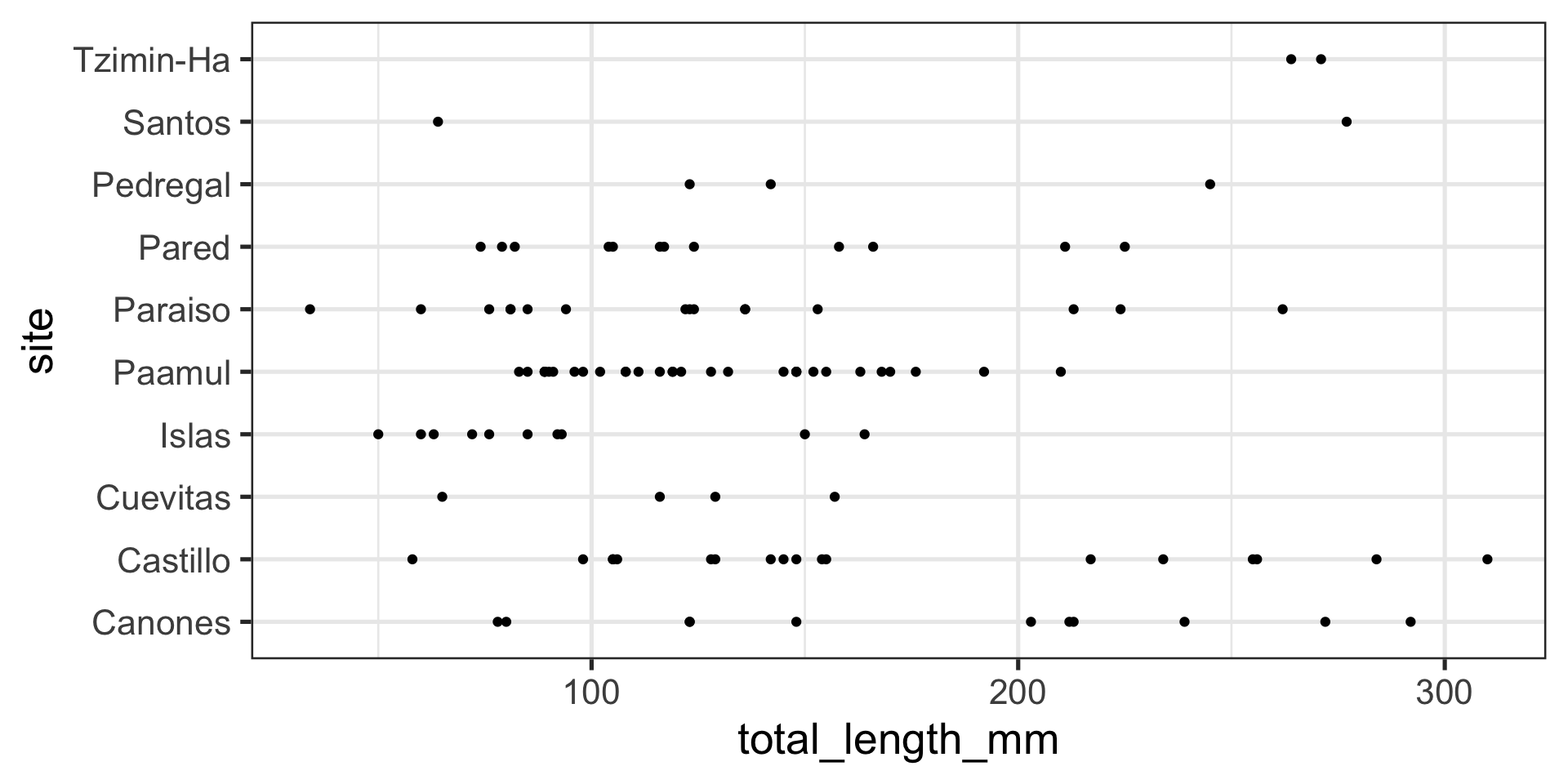
Position adjustments with points
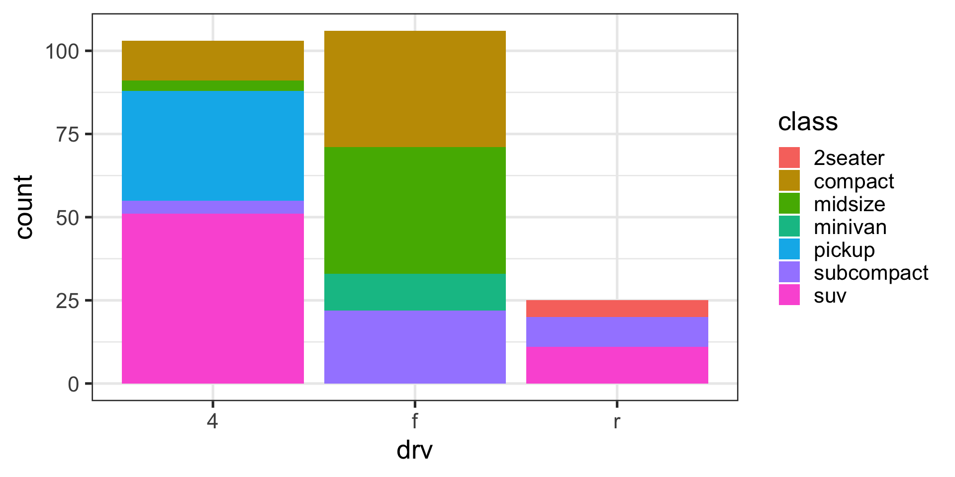
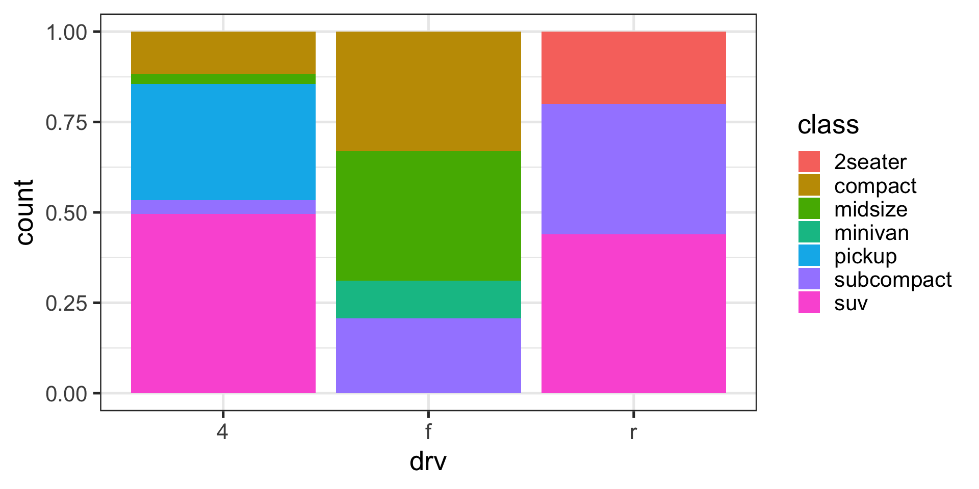
Position adjustments with bars
Stack (default)
Position adjustments with bars
Identity
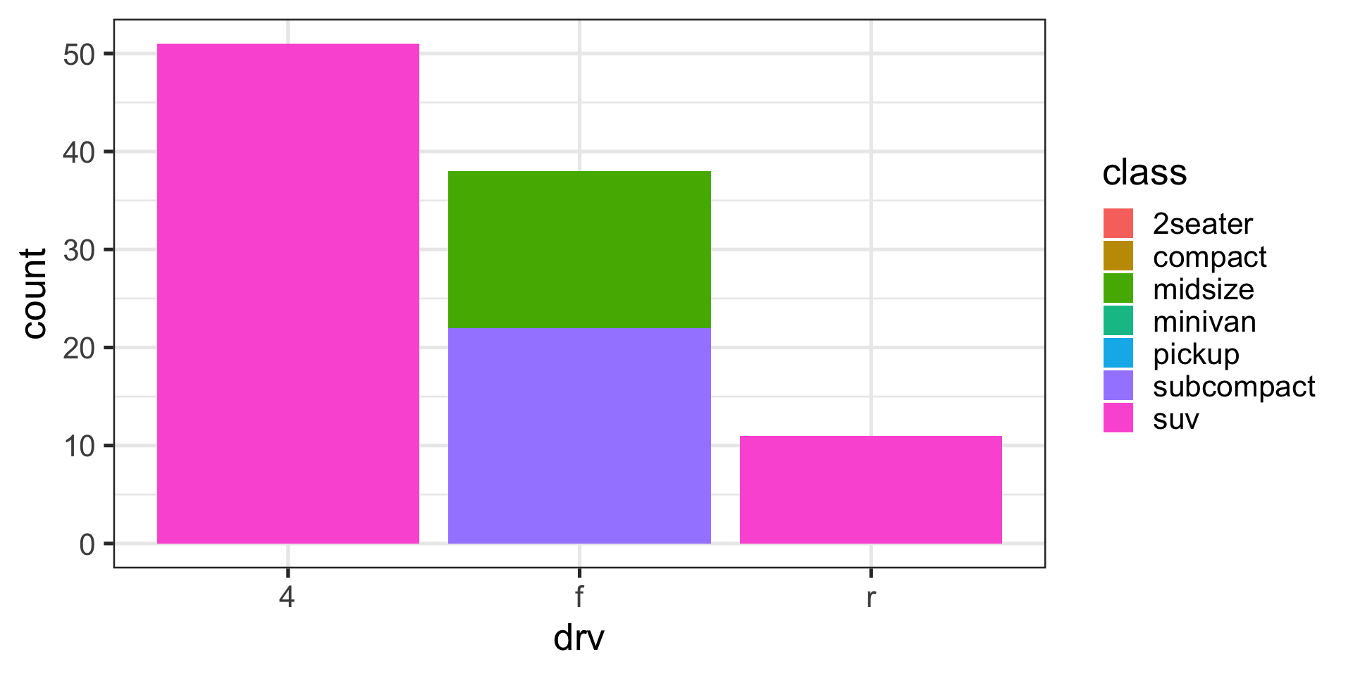
Position adjustments with bars
Dodge
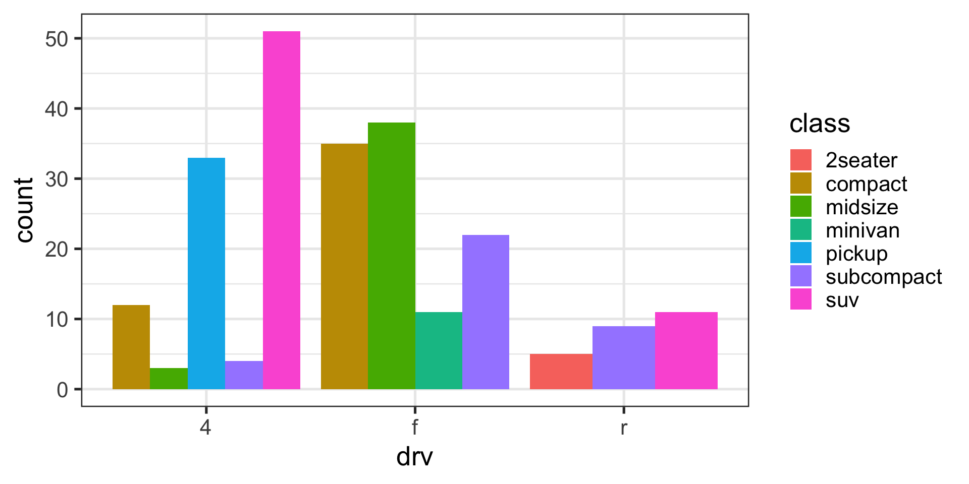
Position adjustments with bars
Fill
Special characters in your plots
- subindices go inside “
[]” - superscripts go after “
^” - greek letters are directly typed
- Use “
~” for spaces - See
?plotmathfor a full list
Code
data <- read_csv("https://gml.noaa.gov/webdata/ccgg/trends/co2/co2_daily_mlo.csv",
                 skip = 32,
                 col_names = c("year", "month", "day", "decimal", "co2_ppm"))

ggplot(data,
       aes(x = decimal, y = co2_ppm)) +
  geom_line() +
  theme_minimal(base_size = 10) +
  labs(x = "Date",
       y = quote(CO[2]~concentration~(ppm)),
       caption = "Data from the Global Monitoring Laboratory")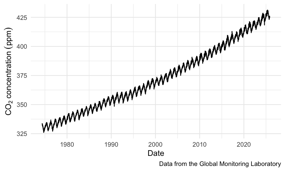
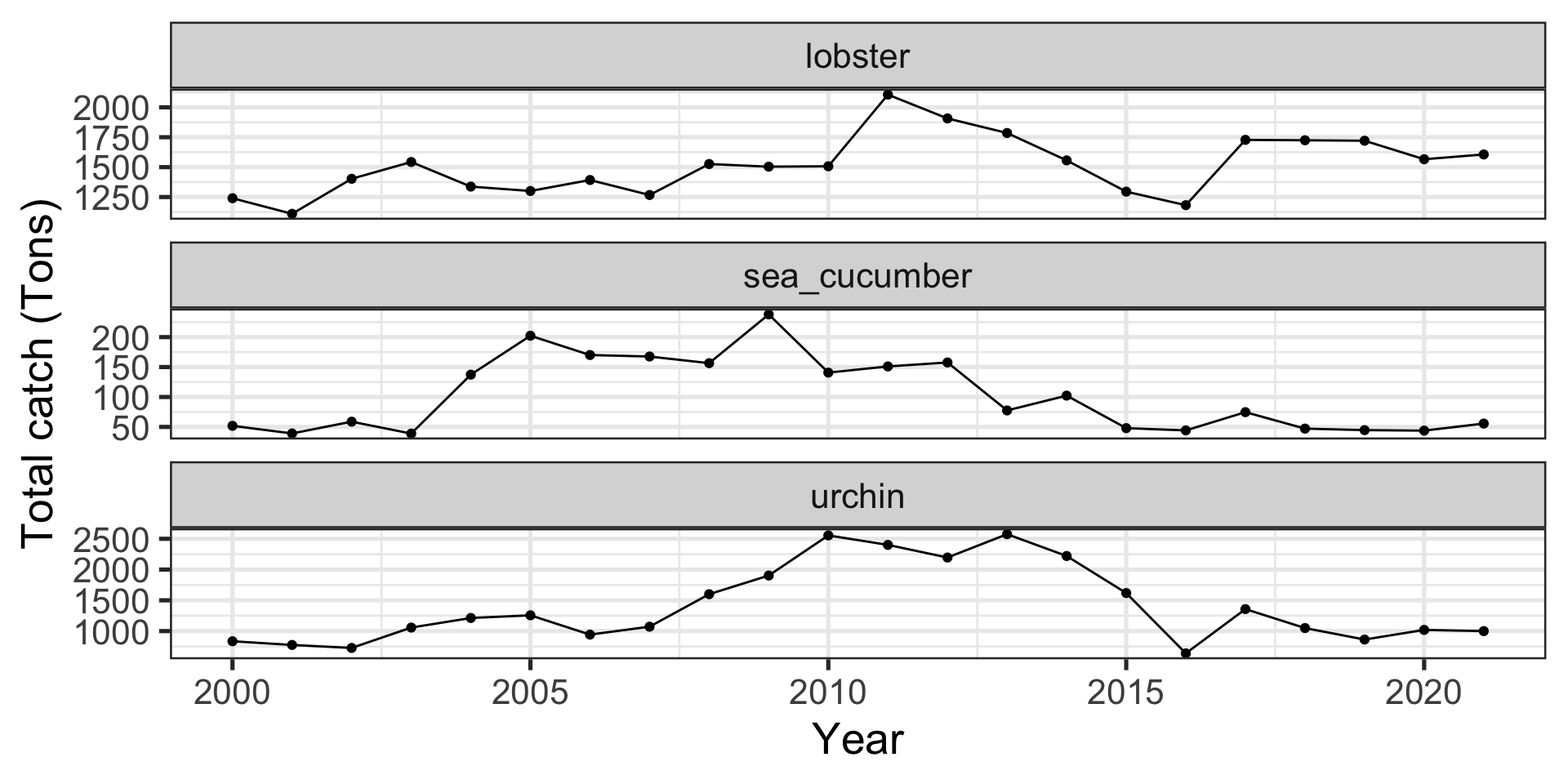
Summarizing data on the fly
Sometimes you might not want to group_by and summarize, but you can go straight into a figure
Code
ggplot(data_heatwaves,
       aes(x = year,
           y = temp_mean)) +
  stat_summary(geom = "pointrange", fun.data = "mean_se") +
  stat_summary(geom = "line", fun = "mean") +
  scale_x_continuous(breaks = seq(1985, 2020, by = 10)) +
  facet_wrap(~str_to_sentence(str_replace(fishery, "_", " ")),
             ncol = 2,
             scales = "free_y") +
  labs(x = "Year",
       y = "Mean Temperature (°C)")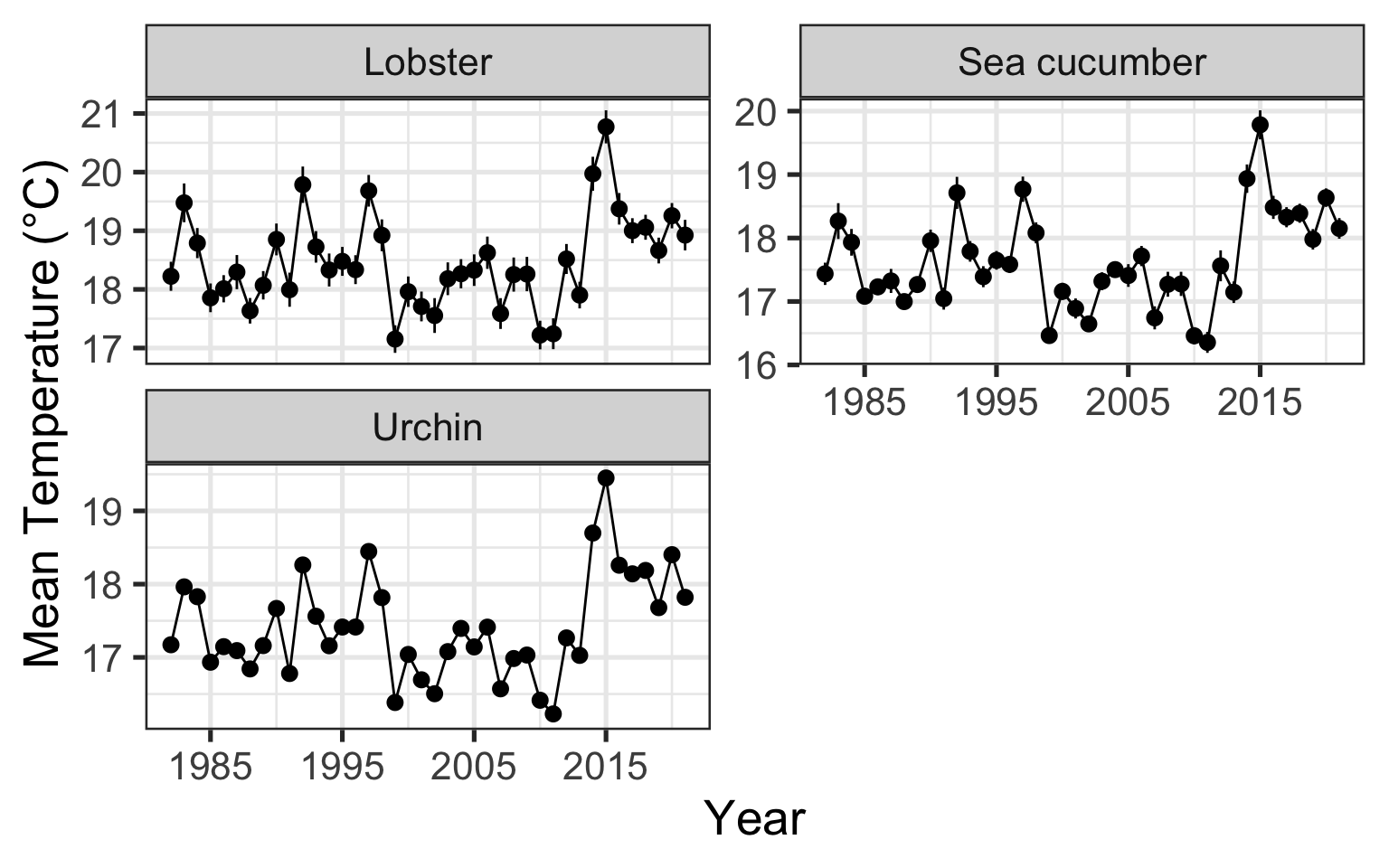
Quarto markdown
- Allows you to build documents
- slides
- html files
- pdfs
- word documents
- books…
- Particularly useful if your document heavily depends on R-generated content